Abstract: This article analyzes the critical role of color matching in swimsuit design, examining factors that influence color selection, principles of effective color coordination, and techniques for achieving optimal harmony. It also highlights how proper color matching can enhance design impact and meet consumer preferences. Swimsuits are specifically designed to enhance performance in water sports, offering both comfort and targeted support for optimal movement and fit. In addition to style, fabric, and pattern, color is a critical design element. It plays a crucial role in the overall design process. Color matching is a key technique for achieving effective color combinations. A thorough analysis of color matching in swimsuit design offers key insights for the development of innovative concepts.
The aesthetic appeal of swimsuit colors is determined by the balance and harmony of hues, which are influenced by factors such as the wearer's skin tone, body shape, and the surrounding environment.
Color significantly influences human psychology. Studies indicate that each color carries specific associations, with variations in brightness and saturation evoking emotional responses. For example, red, orange, and yellow in the warm color spectrum convey youth and passion, while blue, purple, and green in the cool spectrum evoke calmness and sophistication. Black, white, and gray symbolize simplicity and elegance.
Individuals with fair skin tones should opt for swimsuits in warm, vibrant colors, such as orange, cinnamon, or Tiffany green. Blue-green tones accentuate the orange-red undertones, while red and pink swimsuits enhance the natural flush, improving the complexion. However, dark or neutral colors may highlight skin paleness.
Ivory skin tones have subtle yellow-green undertones, giving the skin a soft, luminous appearance that conveys a lively, healthy, and youthful look. Warm orange-red tones enhance the skin's natural radiance, while red and green tones accentuate its rosy undertones. However, yellow, purple, and blue tones can emphasize yellowish hues, leading to a dull appearance.
Pink skin tones complement a wide range of colors, including sophisticated grays and muted shades. Colors with varying hues, brightness, and saturation enhance the natural beauty of pink skin tones.
Individuals with yellow undertones should opt for soft magenta, yellow, teal green, orange, watermelon red, or rose red in cooler tones. Purple and yellow tones are not recommended, as they may accentuate yellow undertones. The cool tones of navy blue and olive green complement the skin tone, enhancing a healthier visual appearance. Black, gray, and purple tones should be avoided, as they can create a dull look.
Wheat skin tones feature a combination of yellow and red undertones. Individuals with wheat skin tones can benefit from swimsuits in cool tones, which help balance the skin's natural yellow undertones and enhance its overall appearance. Light colors with high contrast, such as ivory white, can further enhance contrast and create a more striking visual effect.
Body shape plays a crucial role in swimsuit color coordination. A key objective in swimsuit design is to accentuate the wearer's strengths while minimizing any perceived flaws. An effective swimsuit can diminish the appearance of imperfections and enhance the overall silhouette. For example, warm colors create a sense of expansion, while cool colors evoke contraction. Individuals with slender body types should opt for swimsuits in warm, bright colors, which help create balance and a fuller look. Taller individuals should avoid swimsuits in a single color, as this can elongate the body vertically, emphasizing height. Those with taller, fuller body types may prefer dark colors, such as navy blue, burgundy, and tan, which create a slimming effect and help define their shape. Swimsuit designs can also incorporate visual illusions to enhance proportions and create a more balanced silhouette.
The color proportions in swimsuit design are influenced by color harmony and the wearer’s body shape. Color proportions are categorized by numerical ratios, area distribution, and light-dark contrast balance. Different ratios produce varying visual effects. Properly coordinated color proportions enhance the visual impact of the design. Common color proportions include the golden ratio, geometric ratios, and arithmetic ratios.
Swimsuit designs often utilize multiple colors. Therefore, maintaining color balance is essential to achieve the desired aesthetic and visual harmony. To enhance color balance, adjustments in position, light-dark contrast, and area ratios can be strategically applied. These adjustments improve visual harmony, enhance the overall aesthetic, and accentuate the wearer’s form.
During swimsuit design, specific areas, such as the waist, chest, or shoulders, can be highlighted by emphasizing color in those regions, while minimizing color use in other areas. This approach helps avoid monotony in swimsuit styles.
A well-structured color arrangement highlights the distinctive features of swimsuit designs. Color arrangement involves both partial variations and overall visual cohesion. Partial variations involve applying distinct colors to different parts of the swimsuit design while maintaining color coordination to enhance contrast. Overall visual cohesion involves utilizing different colors within the swimsuit design to create a unified appearance, ensuring a strong visual impact.
In swimsuit design, repeating the same color across different areas fosters color association. Color association ensures the colors complement each other, creating visual harmony and enhancing the overall cohesion of the swimsuit design.
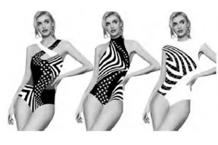
Black, white, and gray are classified as achromatic colors. When used for contrast and combination, these colors can produce various artistic effects, balancing visual tension and harmony, while enhancing the impact of black-and-white swimsuits. For instance, combining black and white in different proportions and patterns enhances visual tension and highlights the bright, clean, and elegant aesthetic of the swimsuit. In the design example shown in Figure 1, black and white serve as the primary colors for the swimsuit. Black conveys a composed, authoritative tone, symbolizing elegance, while white evokes individuality, independence, and grace, representing purity. The black-and-white design creates harmony, conveying a calm, composed, and confident demeanor for the wearer. Swimsuit designs featuring alternating black-and-white lines offer a fashionable, avant-garde appeal, complementing the minimalist style and accentuating the wearer’s elegance.

Figure 1 Achromatic color matching design example
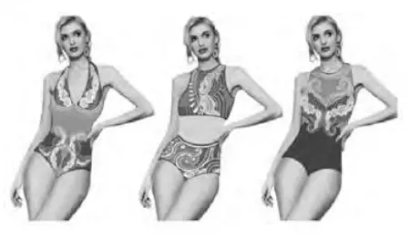
Using colors of the same hue with varying brightness and saturation is a key technique in swimsuit color design. Bright colors evoke a vibrant, energetic feel, while darker tones impart a more subdued, sophisticated appearance. For example, pairing gray-blue with light blue creates a calm, soothing effect. While using a monochromatic color scheme can add layered depth to a swimsuit design, balancing the proportion, brightness, and saturation of colors is crucial. As shown in the design example in Figure 2, light blue, gray-blue, traditional blue, and Tibetan blue are incorporated into the swimsuit’s color palette. Blues in varying shades and saturation are strategically distributed across the swimsuit to prevent the repetitive use of colors with similar saturation and brightness. This enhances color harmony, emphasizes primary and secondary colors, and creates depth, highlighting the subtle, graceful elegance of the wearer.
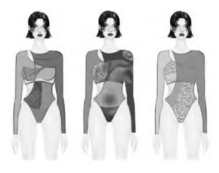
Adjacent hue matching involves harmonizing colors next to each other on the color wheel, typically within a 60-degree range, such as blue and purple, red and orange, or yellow and orange. When matching adjacent hues, it is crucial to balance the color proportions, such as 1:2, 3:5, or 4:7, to create a harmonious visual effect. Adjacent hues often feature bright colors to express the wearer’s energy and spontaneity, evoking a sense of passion and vitality. As shown in the design example in Figure 3, the swimsuit features a prominent area of lake blue, complemented by smaller sections of light blue, a large area of wine red accented with magenta, and a substantial portion of khaki with hints of medium yellow. Small accents of adjacent hues are strategically placed around the waist and abdomen to emphasize key areas, highlight the primary section, and de-emphasize the secondary areas, creating a strong visual impact.

Figure 2: Design case of matching the same hue

Figure 3: Design Example of Matching Adjacent Hues
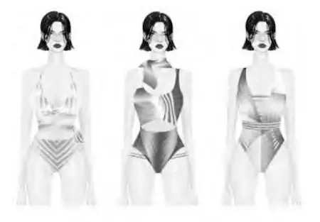
Contrasting hue matching involves pairing colors that are 120° to 180° apart on the color wheel, such as red and green, blue and orange, or purple and yellow. These color pairs create strong contrast, and their combination can produce a stimulating or jarring visual effect. Therefore, in swimsuit design, reducing the saturation and brightness of contrasting hues is important to soften the overall effect and achieve better harmony. When applying contrasting hues, careful attention must be paid to the proportion of each color within the design to enhance visual impact. As shown in Figure 4, emerald green and lavender are the primary colors featured in the swimsuit. Green evokes vitality, while lavender conveys nostalgia and innocence. The design utilizes three techniques—brightness gradient, hue gradient, and purity gradient—to blend the two colors, enhancing visual contrast and highlighting the wearer’s natural beauty.

Figure 4: Design Example of Contrasting Hue Matching
Color matching plays a pivotal role in swimsuit design, contributing significantly to the overall success of the final product. Its effective application enhances visual appeal and ensures the design stands out in the market. By carefully coordinating color choices, designers can amplify the distinct features of the swimsuit and boost consumer attraction.